
.......................................................................................................
.......................................................................................................
.......................................................................................................
About CountOn 📋
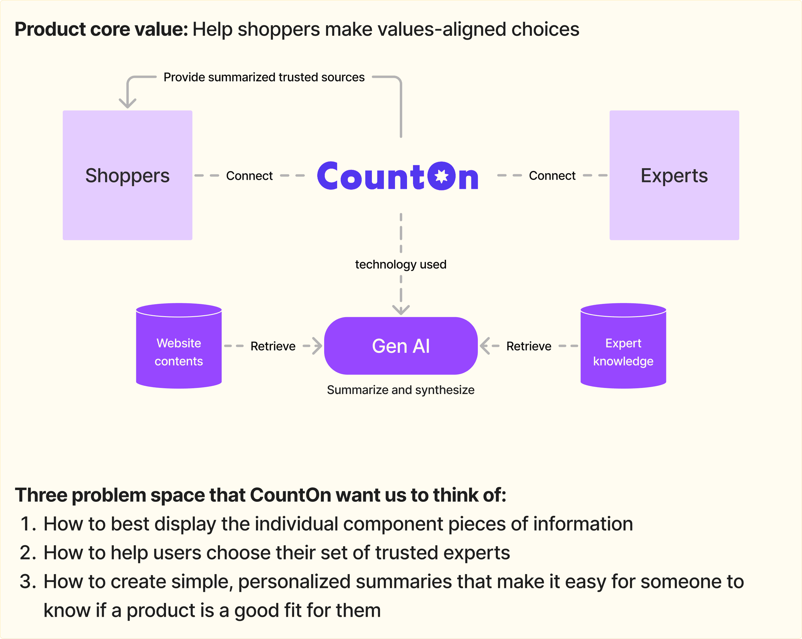
CountOn is a health and sustainability focused startup reimagining the way consumers shop for personal care products. The platform uses generative AI to help shoppers make values-aligned decisions by summarizing insights from a customizable set of trusted experts. By extracting product details such as brand, title, and ingredient lists directly from websites, CountOn cross-references this data with guidance from selected experts to deliver clear, personalized product evaluations.
The company aims to help people shop in a way that matches their health needs, personal values, and sustainability goals. CountOn is currently focused on personal care products, with plans to expand to other categories.
Duration
Role
Team
Tools
Jun - Aug 2024
UI/UX Design
UX Research
Web Design
Mobile Design
Jenn
Inika
Ting-Yin
Nayoung
Sue
Me!
Figma
Notion
Zoom
Goal/Scope 🌟
To design a product analyzer experience for CountOn that helps users quickly assess whether a personal care product aligns with their health and sustainability values.
The focus was on displaying expert-backed insights in a clear, trustworthy, and user-friendly way, optimized for desktop and responsive on mobile.
Competitive Analysis 📖
We compared CountOn’s initial product analyzer with one direct competitor and three indirect competitors, all of which were skincare ingredient checkers.
Our main takeaway: While text-heavy design can look more professional and show more details, illustrations help with readability and usability.
User Research 🔎
Short content
Text-heavy
Illustration-heavy


Direct
Indirect
Indirect
Indirect


Shows information briefly
Offers short explanations for jargon
Rates by communities & creators
Separates overview from detailed ingredients list
Various icons to represent redundant information
Clear about where the ratings come from
Clear navigation & information hierarchy
Lots of visual cues & guidance (icons, colors, pictures)
Rates by community & peer-reviewed research
Very long list of ingredients & detailed explanations for each one
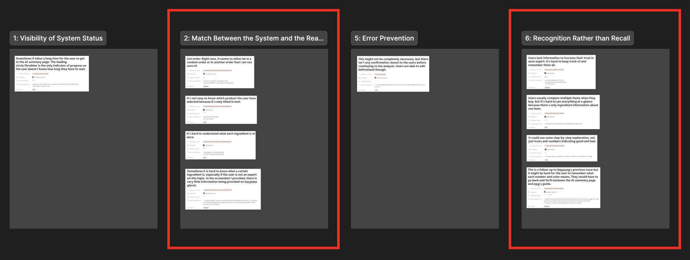
Heuristic Evaluation
Usability Testing
Testing Results
A teammate and I evaluated CountOn’s original interface using NN/g’s 10 usability heuristics. We used Notion to document and organize our findings.
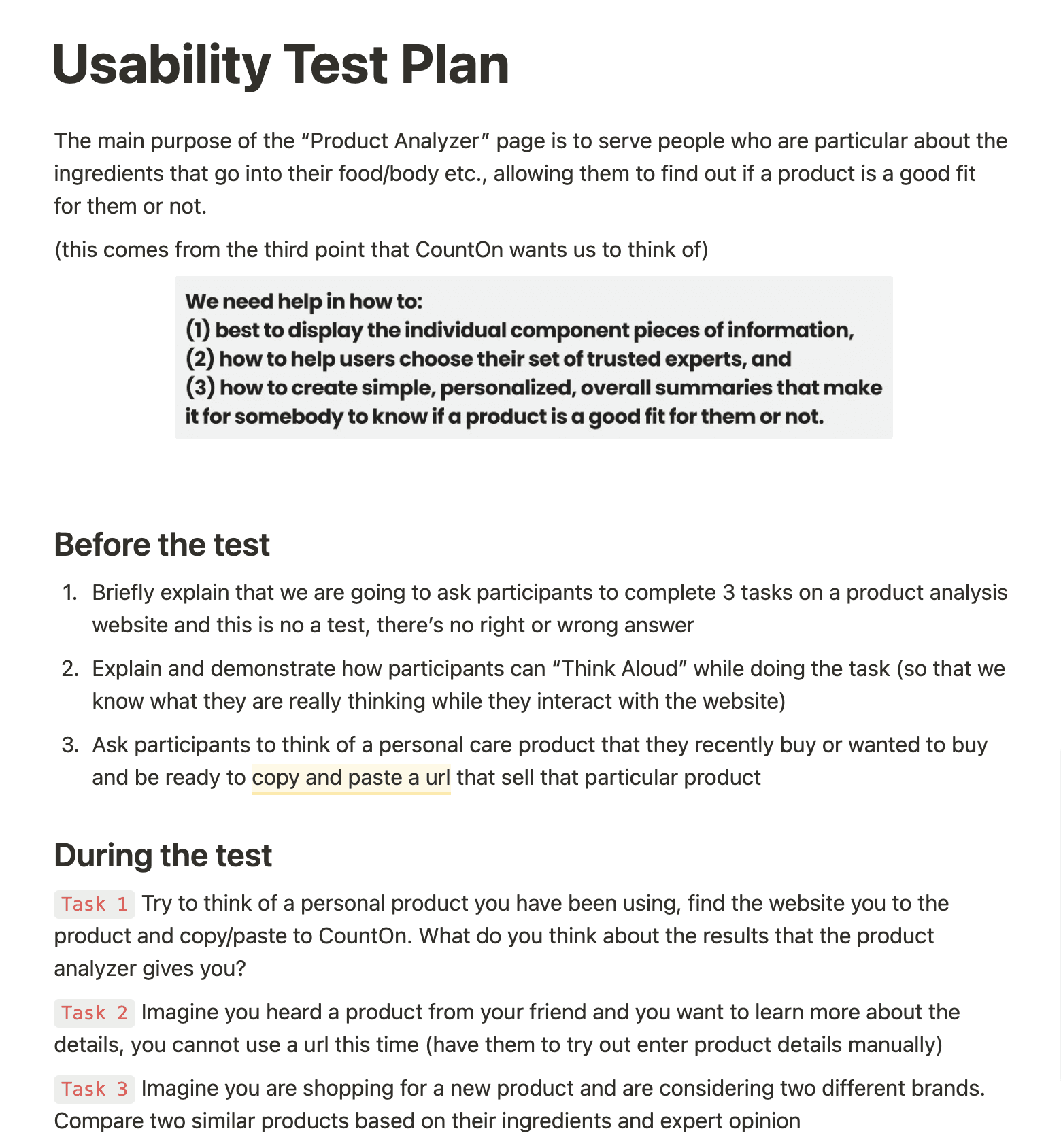
In this phase, each person in our team recruited two participants (12 total) to conduct usability testing on CountOn’s original product analyzer.
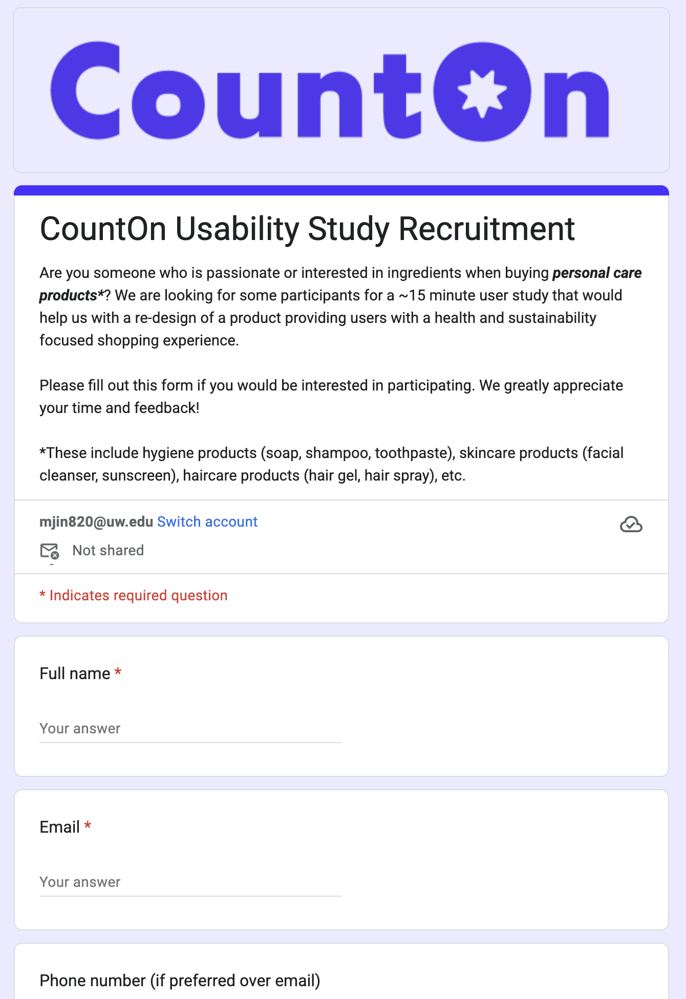
We first started by creating a usability test plan and a screening survey for participant recruitment.
Then, we created a recruitment survey to find 12 participants. We surveyed participants on their product research and decision-making habits for personal care items.
Each team member conducted two 15 to 30-minute usability testing sessions via Zoom. Participants were asked to share their screen, complete three assigned tasks while thinking aloud, and answer a few follow-up questions.
Below are the key insights we gathered from the sessions:
Try to think of a personal product you’ve been using. Find the website for that product and copy/paste to CountOn. Then, reflect on the product analyzer’s results.
Imagine you heard of a product from your friend and you want more information. However, you can’t use a URL this time -- try entering product details manually.
Imagine you’re shopping for a new product and are considering two different brands. Compare two similar products based on their ingredients and expert opinions.
Here are the three tasks that we asked our participants to attempt during the test:
Categorized by: Issue, Recommendation(s), Interface/Screenshot, Heuristic, Severity
Findings elaborated
Found 2 major violated heuristics: 2 - Match Between the System and the Real World, 6 - Recognition Rather than Recall

Task 1
Task 2
Task 3
UX Research & Design: CountOn 🛍️
A redesign of an AI sustainability shopping startup's mobile and laptop interfaces